Inference Scaling and the Log-x Chart
Toby Ord
Improving model performance by scaling up inference compute is the next big thing in frontier AI. But the charts being used to trumpet this new paradigm can be misleading. While they initially appear to show steady scaling and impressive performance for models like o1 and o3, they really show poor scaling (characteristic of brute force) and little evidence of improvement between o1 and o3. I explore how to interpret these new charts and what evidence for strong scaling and progress would look like.
From scaling training to scaling inference
The dominant trend in frontier AI over the last few years has been the rapid scale-up of training — using more and more compute to produce smarter and smarter models. Since GPT-4, this kind of scaling has run into challenges, so we haven’t yet seen models much larger than GPT-4. But we have seen a recent shift towards scaling up the compute used during deployment (aka 'test-time compute’ or ‘inference compute’), with more inference compute producing smarter models.
You could think of this as a change in strategy from improving the quality of your employees’ work via giving them more years of training in which acquire skills, concepts and intuitions to improving their quality by giving them more time to complete each task. Or, using an analogy to human cognition, you could see more training as improving the model’s intuitive ‘System 1’ thinking and more inference as improving its methodical ‘System 2’ thinking.
There has been a lot of excitement about the results of scaling up inference, especially in OpenAI’s o1 and o3 models. But I’ve seen many people getting excited due to misreading the results. To understand just how impressed we really should be, we need to get a grip on the new ‘scaling laws’ for inference. And to do this, we need to understand a new kind of chart that we’ve been seeing a lot lately.
Here is the chart that started it off — from OpenAI’s introduction to o1.
On the left are the results of scaling training compute and on the right are the results of the new paradigm of scaling inference compute. The y-axis shows a measure of AI capability, while the x-axis shows the costs of achieving that capability. At first glance, they appear to show healthy progress, with capabilities steadily marching upwards in response to more compute. But a closer inspection shows that the x-axis is on a log scale.
This is very unusual in the world of charts.
We often see charts where the y-axis is on a log scale — these help fit the dramatic exponential progress a field is making onto a single chart without the data points bursting through the top of the frame. Straight lines on such a chart (like the chart for Moore’s Law below) understate the amazing progress that is being made — making exciting exponential progress look like merely respectable linear progress:
But in these new charts for inference scaling it is the x-axis that’s a on log scale. Here the linear appearance of the data trend is overstating how impressive the scaling is. What we really have is a disappointing logarithmic increase in capabilities as more compute is thrown at the problem. Or, put another way, the compute (and thus the financial costs and energy use) need to go up exponentially in order to keep making constant progress. These costs are rocketing up so much that the expenses of these models would be bursting off the side of the page if not for the helpful log scale.
Such charts are rare in science and technology, but are sometimes needed when a dependent variable is extremely insensitive to changes in the independent variable. They are technically known as linear-log charts (as opposed to the more familiar log-linear charts). Unfortunately both names are useless for communication unless everyone memorises which order the axes are named (which isn’t the standard order). So I suggest we simply call these charts with a logarithmic x-axis: ‘log-x charts’.
Brute force
An exponential increase in costs is the characteristic signature of brute force. It is how costs often rise when you just try the most basic approach to a problem over and over again. That doesn’t mean that o1 or o3 are brute force — sometimes even refined solutions have exponential costs. But it isn’t a good thing. In computer science, exponentially increasing costs are often used as the yardstick for saying that a problem is intractable (or that the current approach to it is).
So are o1 and o3 doing better than brute force? It is hard to know given the secrecy surrounding their launches (note the lack of numbers on the x-axis above). But helpfully, a different team have explored a true brute force approach to see what happens. In the paper ‘Large Language Monkeys’, they try solving the problems in a variety of benchmarks by just running the LLM tens, hundreds, or thousands of times and taking the best solution it comes up with. This is a strategy that is practical in some domains where you can cheaply check whether a candidate solution is correct.
Helpfully, they presented their results on log-x charts for easy comparison:
As with OpenAI’s o1 results, these brute force results typically looked quite linear during the regime where the system was climbing from about 20% to about 80%. This means that most of the progress through the benchmark was roughly exponential in cost for each percentage point of further gain.
Note that in cases like these, it is not possible for the graph to be linear all the time, as progress on the benchmark is capped at solving 100% of the cases. Zooming out enough (such as on the chart below), you see a kind of S-curve. But these are still well-summarised as logarithmic returns on inputs since the region where most of the gains happen looks quite linear on this logarithmic x-axis.
This means it is hard to distinguish o1’s scaling from brute force scaling just from looking at a log-x chart. My educated guess is that o1 is performing better than brute force — otherwise why would it have taken so long to develop? — but the quantitative data they’ve shared doesn’t provide much evidence, nor allow us to see how much better than brute force it is.
What about o3?
When o3 was released, one of the key results was its progress on the general intelligence benchmark ARC-AGI. This is a set of puzzles designed to be very simple for humans, but beyond the reach of existing LLMs. And the results were given in the form of another log-x chart:
The message most people seem to have taken from it is that the o3 results (in yellow) are much better than the o1 results (e.g. that the shift to o3 has solved the benchmark or has reached human performance).
But this isn’t clear. The systems are never tested at the same level of inference cost, so this chart doesn’t allow any like-for-like comparisons.
While the yellow dots are higher, they are also a lot further to right. It doesn’t look like that much but remember that this is a logarithmic x-axis. The ‘low’ compute version of o3 is using more than 10 times as much inference compute as the low compute version of o1, and the high compute version of o3 is using more than 1,000 times as much. It is costing about \$3,000 to perform a task you can get an untrained person to solve for \$3.
This matters.
While it is true that costs in AI often come down quickly, a gap of three orders of magnitude is still a big deal. Epoch’s best estimates for the rate of algorithmic improvements in AI over recent years are that they lower the compute needed by about a factor of 3 each year. And compute is getting about 1.4x cheaper each year, meaning that the total compute costs each year would be expected to come down by about a factor of 4 on current trends. If so, it would be about 5 years for the costs of that high-compute version of o3 to come down by that factor of 1,000 and become economical. While these o3 results came out just months after the o1 results, this could easily give a false impression of the rate of progress.
Given historical rates of progress, we are seeing where 5 years of progress should take us, not what 3 months of progress has delivered. OpenAI were giving us a glimpse of what should be possible for the same cost in the year 2030, not what has just become possible in the last few months.
These numbers are not exact. There is substantial uncertainty in Epoch’s factor of 3 each year. There is uncertainty about how many orders of magnitude of algorithmic improvements remain possible (I’d guess more than 3, but they are not unlimited). And there is uncertainty about whether historical record of annual algorithmic improvements for training will under- or over-estimate the annual algorithmic improvements in inference. My best guess is that it will be less than 5 years before AI systems are exceeding o3-high’s 88% on this benchmark at human-level cost. But I do think we’re talking years, and that the idea it was only 3 months of progress to go from 32% to 88% on this benchmark is mistaken and will lead to overestimates of future progress.
So what has o3 done compared to o1? If you look at the three colours of datapoints on this chart, it seems like they are probably not just part of a single trend — a single relationship between inference cost and performance. While it isn’t easy to rule that out just from this chart, if you join up the dots of each colour, they seem to be obeying different trends. Here is a (simplistic) linear attempt to do that:
It appears that the shift from pre-release o1 (green) to regular o1 (red) has moved the trend up in terms of performance for the same cost. It may also have increased the slope slightly, but that is much less clear as the data is noisy, and we’d expect the slope to increase at performance closer to 50% anyway, since the underlying trends are presumably S-curves. Since the horizontal scale of these diagrams is more easily interpretable than the vertical, it is perhaps best to think of the change from green to red as a shift to the left — becoming something like 3 times cheaper for a given level of performance.
It looks like o3 (yellow) is also improved in performance per cost compared to the o1 systems, though it is hard to be sure. By this level of performance, the underlying S-curve makes a big difference and the slope of the trends on the o1 data series would be levelling off too (indeed they may have plateaued at a lower height). OpenAI presumably have an internal version of this same chart where they have tried the models in overlapping regions of compute, which would make it much easier to know for sure. But the difficulty of determining whether o3 is an improvement on o1 from the publicly available data shows that this data is only weak evidence, and we shouldn’t update our views on AI progress much based on it.
Moreover, the o3 models here are labelled ‘(tuned)’ because unlike the o1 systems, they were also fine-tuned for the ARC-AGI benchmark. Whatever your opinion on the validity of doing such tuning, it has presumably provided an extra boost to the results. So some unknown fraction of the improvement in the yellow data series is from fine-tuning against the benchmark rather than the jump from o1 to o3, making it even more of a mistake to read too much into the rate of progress between o1 and o3 from this limited data.
What would good progress look like on a log-x chart?
As we’ve seen, impressive inference scaling isn’t just about having a model that scores well on a benchmark — that could just be an old system with vastly more compute thrown at it. Instead, we need to look at the whole curve.
And it isn’t just moving the curve to the left. That would represent lowering costs by a constant factor. That’s not bad, but when you improve a system with exponential costs by a constant factor, this is not usually regarded as great progress.
One thing that would be much better is if you could change the height at which the S-curve tops out. For instance, if earlier approaches plateaued at 40% on the benchmark and your new approach plateaus at 80%, that would be a substantial demonstrated improvement.
Another would be to change the slope of the graph — compressing it horizontally. To take an example from classical AI, this is what happens if you go from a standard minimax game playing algorithm to a version with alpha-beta pruning. The costs still rise exponentially, but the exponent is halved (which would double the slope of a log-x graph). Alpha-beta pruning didn’t solve game playing, but it was at least a big enough improvement to be worth noticing.
So what we’d want to see is something like this:
This is a log-x chart measuring ability at ML research tasks in a given time budget, by authors at METR. The colourful curves are a range of different LLMs. The grey curve — which bursts out of the pack with its higher slope — is human intelligence.
What substantial progress on inference scaling would look like on log-x charts is this kind of higher slope or higher plateau. If frontier labs want to demonstrate impressive performance in inference scaling using log-x charts, they should show their model’s performance across different levels of inference time alongside data series representing both brute force and human performance. And even if they just want to show progress compared to their old version, they need to plot data series that at least overlap on the x-axis, to allow some domain where like-for-like comparison is possible.
If they do neither, it may just be that they do not want people who read the chart to know how well inference compute is scaling.
Added 25 June 2025:
The ARC-AGI leaderboard now provides exactly the kind of graphs I was seeking, allowing comparisons between different model classes from the same company — or even from different companies. For example, here are all of OpenAI’s models (as of June 2025):
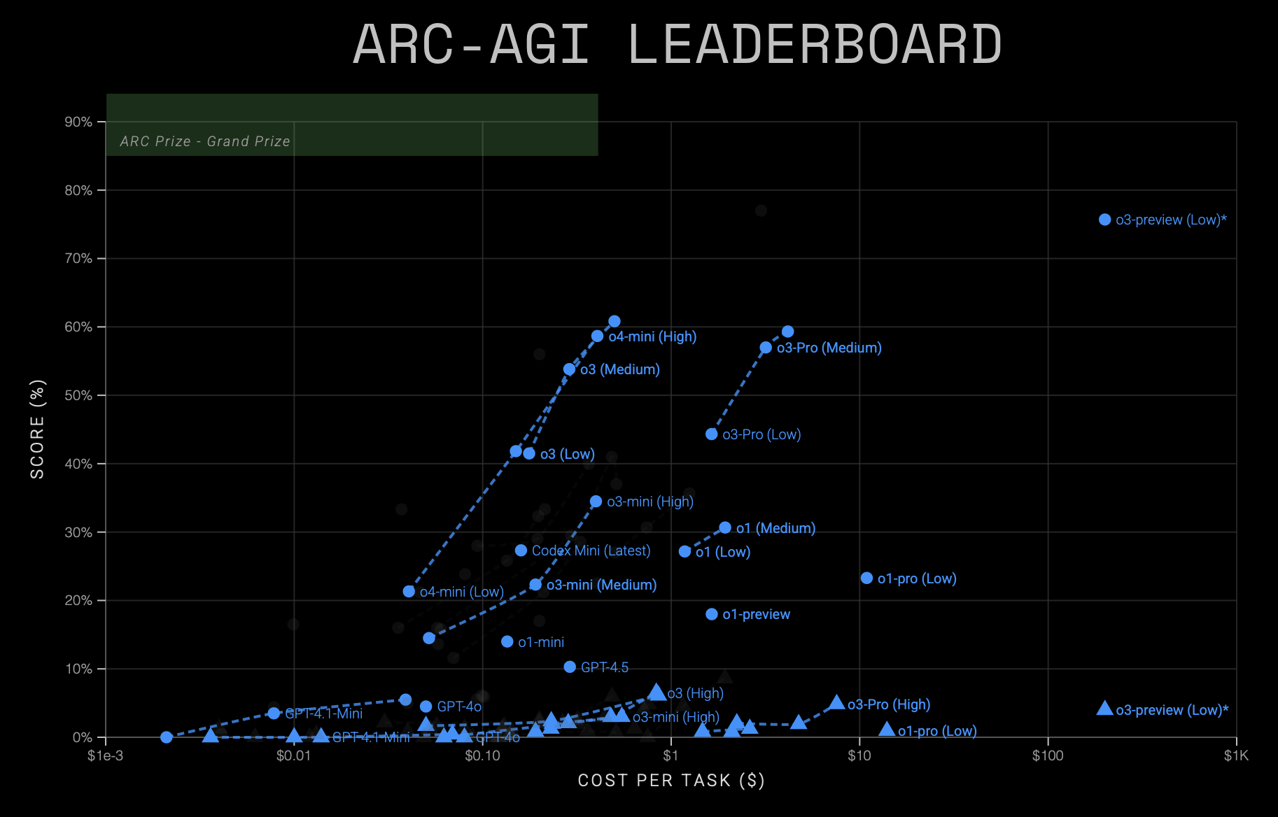
This shows that there has been substantial progress between generations of models, with subsequent models appearing to the left (cheaper) or higher (more capable) than their predecessors. However, they still all appear to be following a similar S-curve — just translated to the left. This suggests that we can mostly understand the improvements in terms of cost-efficiencies, with the improvements from the first o1-preview results to the current generation being about a 50x cost-reduction for the same performance.
There has probably been some capability improvement too, though the chart does not provide clear evidence for it. For example, there may be a higher performance asymptote in the limit of infinite compute, and there may be an increase in the slope of the S-curve for later generations, but the compute ranges over which each model was measured are too short to provide good evidence either way.
21 January 2025